When it comes to running a successful boutique, your design choices don’t stop at fabrics or color palettes. The way you design your store layout directly influences how customers move, what they notice, and ultimately how much they buy. These store layout secrets for maximum traffic are not just about aesthetics — they’re proven strategies to drive engagement, extend browsing time, and boost sales.
Let’s dive into the strategies every boutique owner should master.
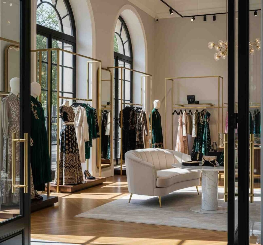
1. First Impressions: The Power of the Decompression Zone
Every boutique has a “decompression zone” — the first few feet inside your entrance. This is where customers adjust to lighting, music, and ambiance. Keep this zone clean and inviting, free from clutter. A single signature display or an iconic piece works best here, instantly setting the mood.
This simple shift can increase browsing time, one of the most overlooked store layout secrets for maximum traffic.
👉 Learn More About Visual Merchandising Basics
2. Right Is Always Right
Research shows that most shoppers instinctively turn right after entering a store. Use this behavioral insight to your advantage. Place your hero products — statement collections, new arrivals, or luxury edits — on the right-hand side to capture immediate attention.
Your boutique’s journey begins here, so make it unforgettable.
3. Create a Natural Flow With Pathways
Customers should never feel lost or forced to backtrack. Design natural pathways that lead them through your collections in a storytelling arc. For example:
- Start: Signature pieces
- Middle: Seasonal collections
- End: Accessories & impulse buys
This guided flow encourages exploration, reduces dead spots, and ensures no collection is overlooked.
4. Zone Merchandising: Strategic Product Placement
Think of your boutique as a map with zones:
- Front zone → Trendy, attention-grabbing items
- Middle zone → Bestsellers and essentials
- Back zone → Discounts, add-ons, or items requiring a deliberate decision
Placing high-demand products at the back ensures customers move through the entire boutique, discovering more along the way. This zoning principle is one of the smartest store layout secrets for maximum foot traffic.
5. Visual Hierarchy: Guide the Eyes, Guide the Wallet
Humans shop with their eyes first. Create visual hierarchy by mixing heights, colors, and textures in your displays. Use mannequins, tiered shelving, and spotlight lighting to draw focus.
Customers are naturally drawn to what stands out — so design displays that make them stop, stare, and shop.
6. Comfort Zones Encourage Longer Stays
Foot traffic is only valuable if customers stay long enough to buy. Add comfort touches like seating, mirrors, or ambient lighting. A well-placed chair near the trial room or soft background music creates a premium experience that encourages lingering.
The longer customers stay, the more likely they are to purchase.
👉 Explore Boutique Interior Design Trends
7. Seasonal Flexibility
Your store layout shouldn’t be static. Rotate displays and rearrange pathways with each season or campaign. Fresh layouts keep regular customers curious and prevent “layout fatigue.”
Think of your boutique like a runway — new every season, yet consistent with your brand.
8. Data Meets Design
Modern boutiques use heat maps and analytics to track customer movement in-store. If certain zones attract little attention, rethink their placement or use stronger visual cues.
A data-driven layout ensures you don’t just guess — you know where customers go and why.
Final Word
The best boutiques aren’t just about products — they’re about experiences. These store layout secrets for maximum foot traffic help you create spaces where customers feel inspired, guided, and eager to buy. From decompression zones to visual hierarchy, every detail matters.
At Boutiques Only — Powered by Damerax, we craft digital and in-store experiences with the same philosophy: design that elevates, engages, and drives results. Your boutique deserves more than foot traffic — it deserves loyal fans who return again and again.